The Romanovs were removed from rule in Russia because of it.
Marie Antoinette and her crew were removed likewise.
There is turmoil in Libya and Egypt right now because there are the few people with much and the many with "not much."
And it's certainly true here in America.
The imbalance between the rich--and really rich--and so many of the rest of us was wide and it has gotten much wider. There is a report out right now, showing these very statistics:
Mother Jones magazine has crunched the data on inequality, and put together a group of stunning new charts. Taken together, they offer a dramatic visual illustration of who's doing well and who's doing badly in modern America.
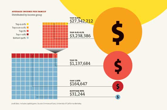
This chart shows that the poorest 90 percent of Americans make an average of $31,244 a year, while the top 1 percent make over $1.1 million:
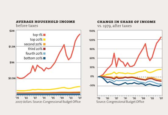
• According to this chart, most income groups have barely grown richer since 1979. But the top 1 percent has seen its income nearly quadruple:
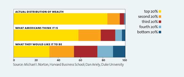
• And this chart suggests most Americans have little idea of just how unequal income distribution is. And that they'd like things to be divvied up a lot more equitably:
To see the rest of the charts, click on over to Mother Jones
It's a matter of a system that rewards the wealthy and very wealthy grossly improportionately.
And it's not healthy for the country, folks.
Link to original posts: http://news.yahoo.com/s/yblog_thelookout/20110223/ts_yblog_thelookout/separate-but-unequal-charts-show-growing-rich-poor-gap


No comments:
Post a Comment